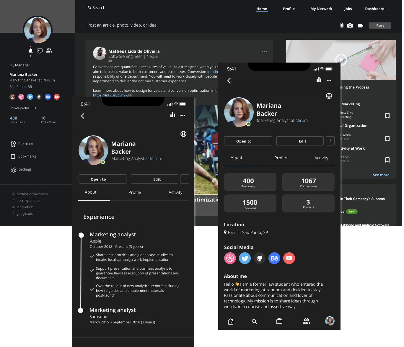
In times of pandemic and unemployment, the number of users has skyrocketed and because of that, filters to search for jobs are being used now more than ever and it's possible to notice some non-intuitive details that have great opportunity for improvement, besides the inconsistent UI and visual pollution in the users' feed and profile.



The focus of this project is to study the main activities of users on LinkedIn, understand what the main pains are and implement improvements to make the tool simpler to use, more pleasant and efficient for the user.
During the process, we did some quantitative and qualitative research and managed to map insights, confirm assumptions and answer questions that we had raised right at the beginning of the project.

Members in 200 countries and regions worldwide
In the quantitative research, it was possible to identify what are people's main activities when using linkedIn. These results were essential to define the personas.

Graduated in Information Systems, he currently works from home as a programmer. He doesn't use social media often and is looking for new job opportunities.

Curriculum, Networking, updating about the marketplace

Networking, content creation, updating about the marketplace

Graduated in law but recently switched to marketing. She uses social media frequently and is always writing articles and generating content.

Graduated in Human Resources, she currently works as a recruiter and is always using LinkedIn to contact potential candidates.

Corporate, Account management, Networking, Headhunting, Community human resources
I'm looking for a job spot
job spots compatible with my search
apply for the ones I'm interested in
Easily apply for jobs that interest me.
Compare which content my connections identify with the most
to be able to analyze post engagement
I make a post
Being able to analyze data to increase engagement
I look for a candidate
to see their personal information and work experience in a clear and simple way.
Quickly filter to find the best candidate
Agility in the search for the ideal candidate
14px - Body (REGULAR)

Aa Bb Cc Dd Ee Ff Gg Hh Ii Jj Kk Mm Nn Oo Pp Qq Rr Ss Tt Uu Vv Ww Xx Yy Zz
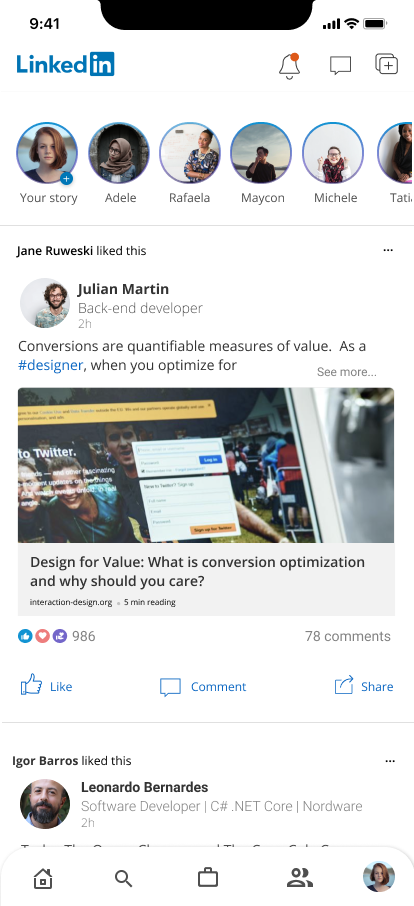
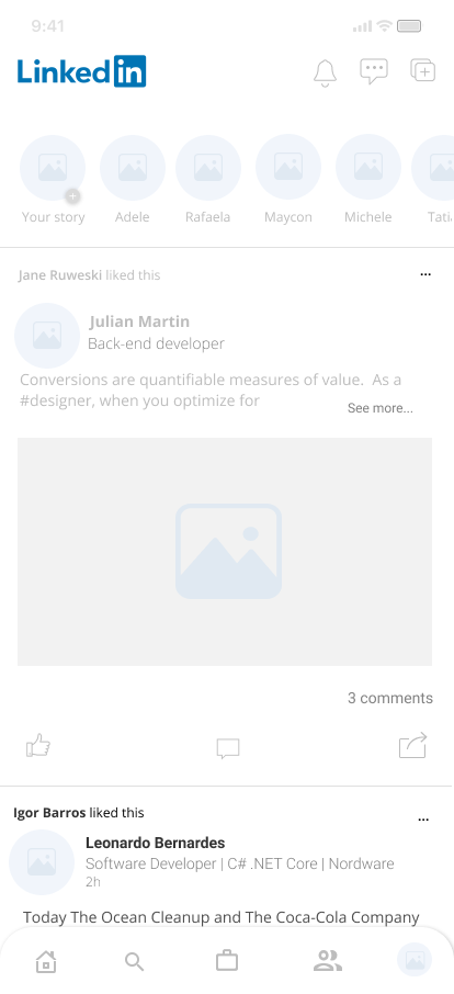
The main changes in the feed were in the top menu, stories and like, comment and share icons. We also changed the position of the profile button that previously required two steps to access
Since the repost button is used less often, we left it at the top of screen
Access to the profile has become easier according to users who have tested this new model
We divided the profile into three tabs to prioritize information and leave a specific space for the main information sought by users when accessing a profile.
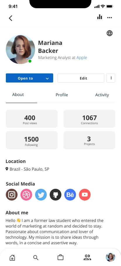
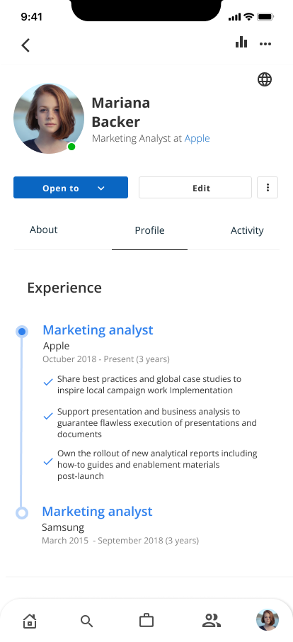
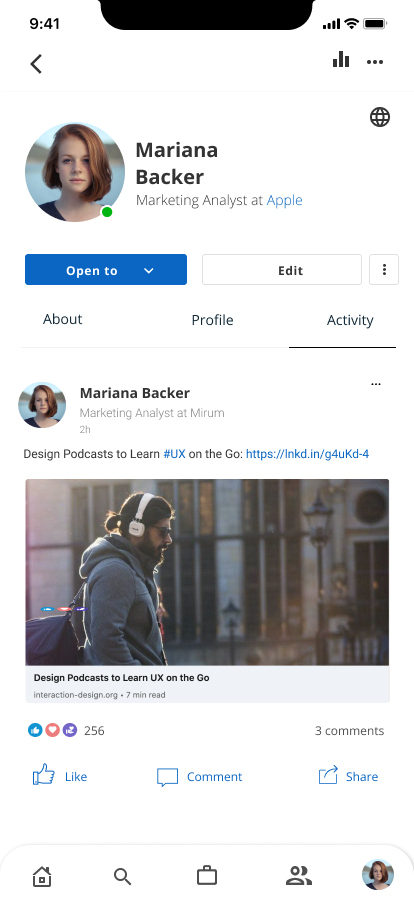
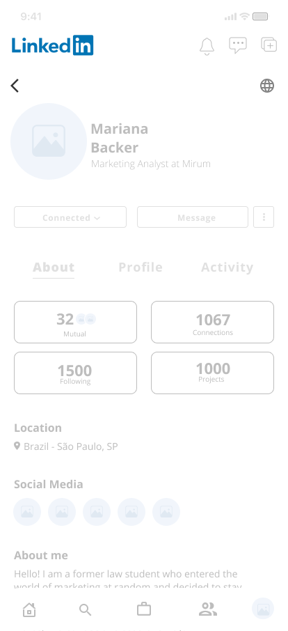
On the “About” tab we have information about connections, location, social networks and a brief introduction
In the profile, we have experience, education, skills, recommendations and projects
And on the last tab we have all posts shared by the user
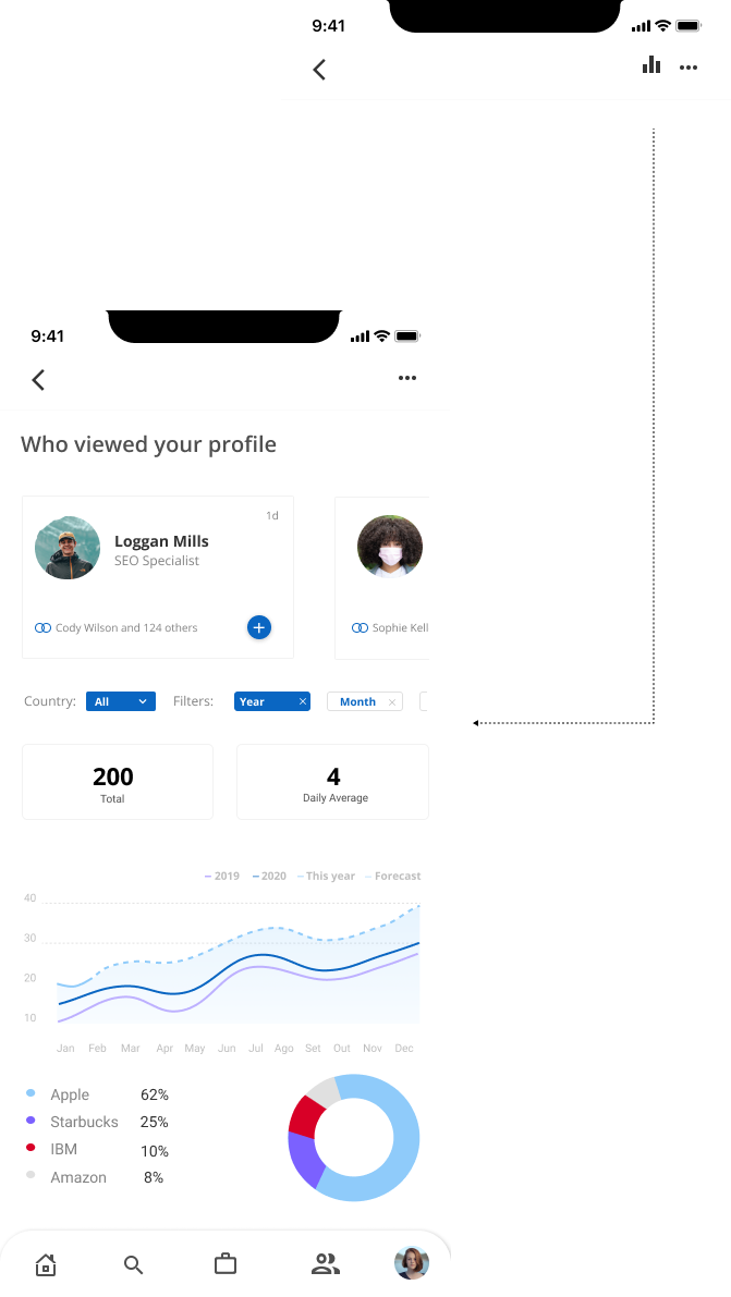
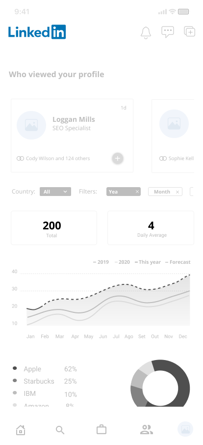
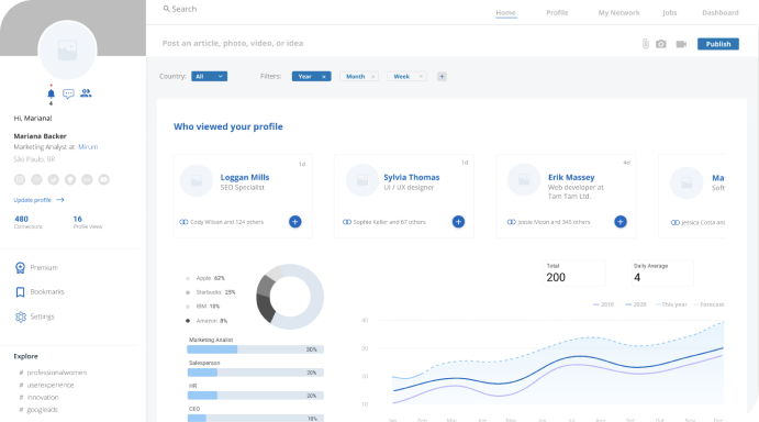
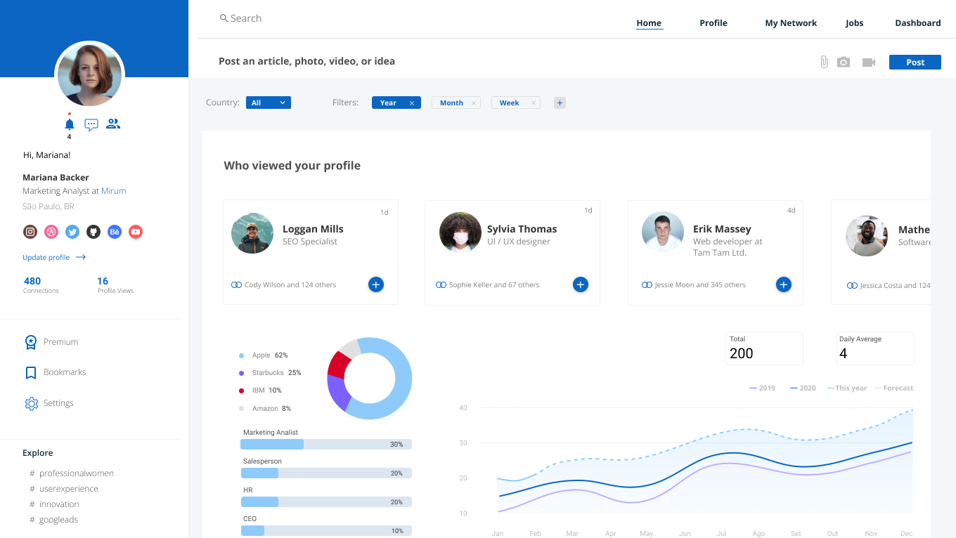
We've added a page that gathers some data about the last people who visited your profile. Below it shows where they work and what their positions are. These charts can be filtered by period and by region.
The search function is also now in the bottom menu and when you click you are taken to a page with some suggestions for people to connect
One of the biggest problems raised by users is that when searching for job spots, the filters do not help. One of the causes is that the recruiters may not inform important points about the position offered, such as the desired level of experience. One solution would be to mark some mandatory fields for the recruiter to fill, that will be used in the search.
In addition to this, users who are looking for a job claim to have to apply on other sites. This might not necessarily be a problem, but a business strategy. This could be solved by LinkedIn encouraging recruiters to use the platform itself to filter and select their candidates. But this also depends on how the platform intends to help recruiters carry out their operation.
By dragging to the side, you can navigate through the other menu options
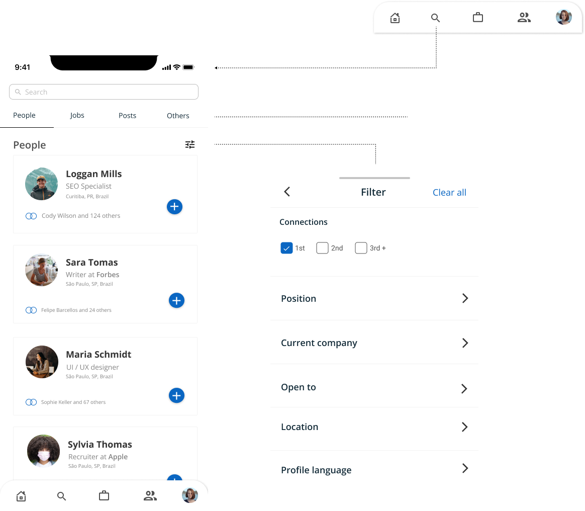
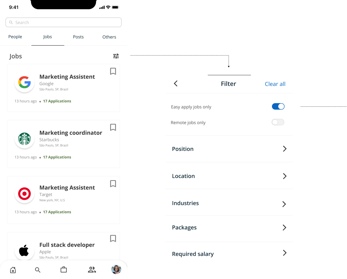
It is possible to filter only by job spots that can apply within the platform, without being forwarded to another site
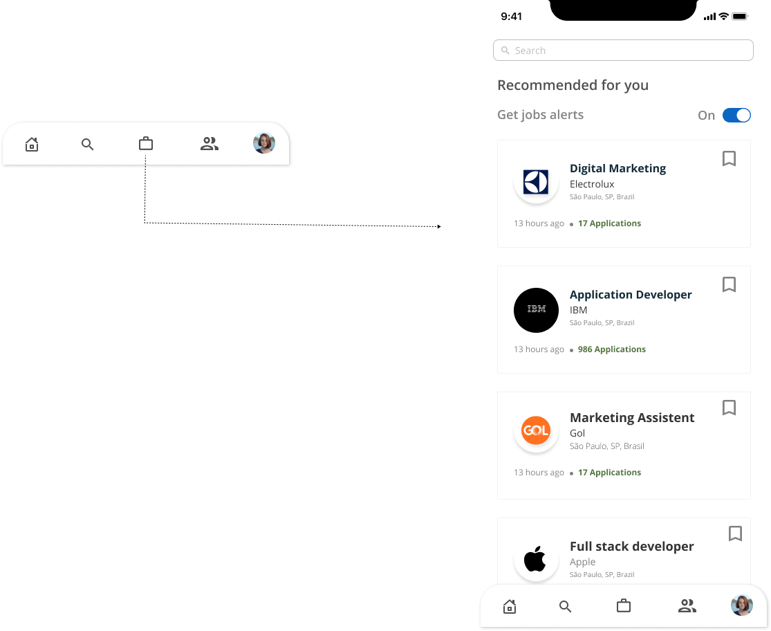
We've made this page as simple as possible, just so the user can view the recommended jobs spots, save for later, see the details and apply
In the desktop feed version we made bigger changes. The menu was located on the upper right corner and the user's personal information was located on the left side menu and they can be viewed regardless of the page the user browses.
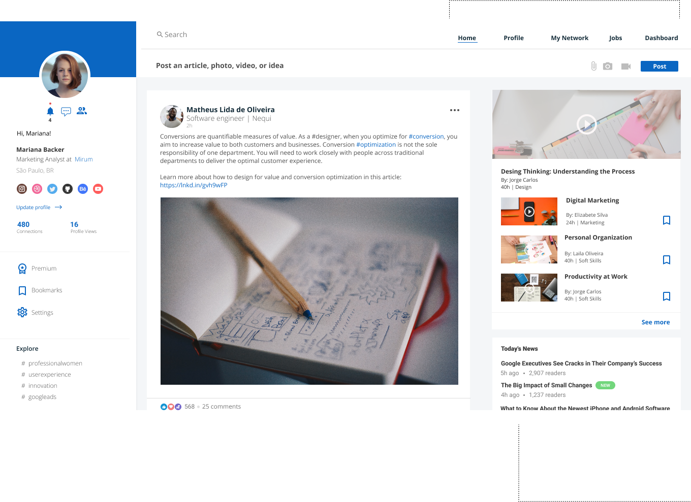
We have included a space for the main news being shared.
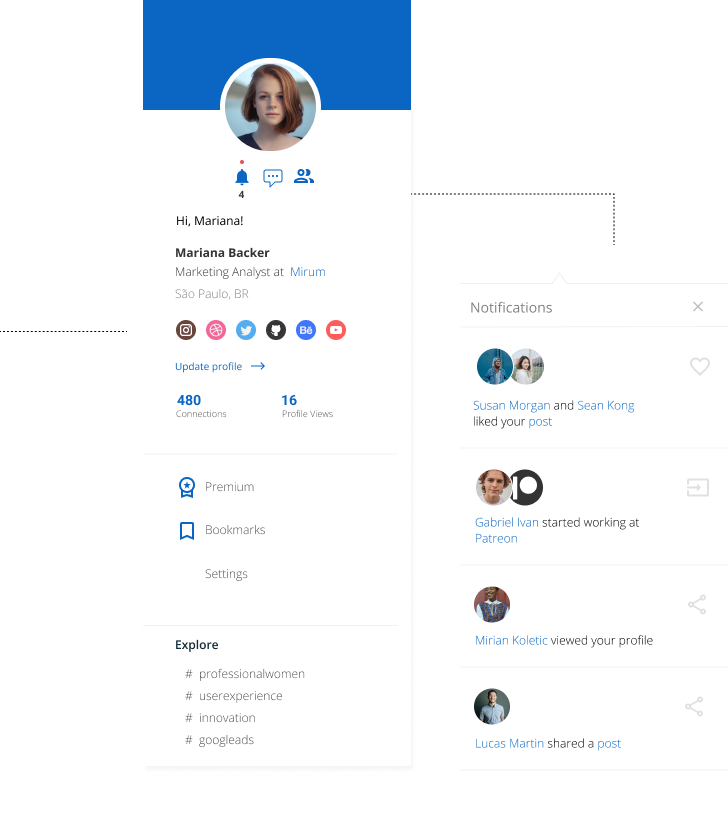
Just like in mobile, here we have a space to add other social networks that make sense for the user to share with their network.
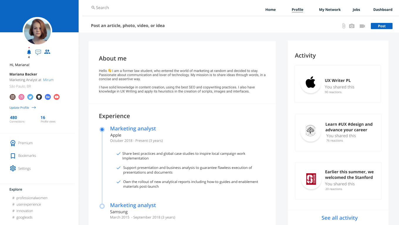
In the profile we keep sections similar to the mobile version, the left menu has the most basic information, in the first block we have experiences and in the second, shared posts
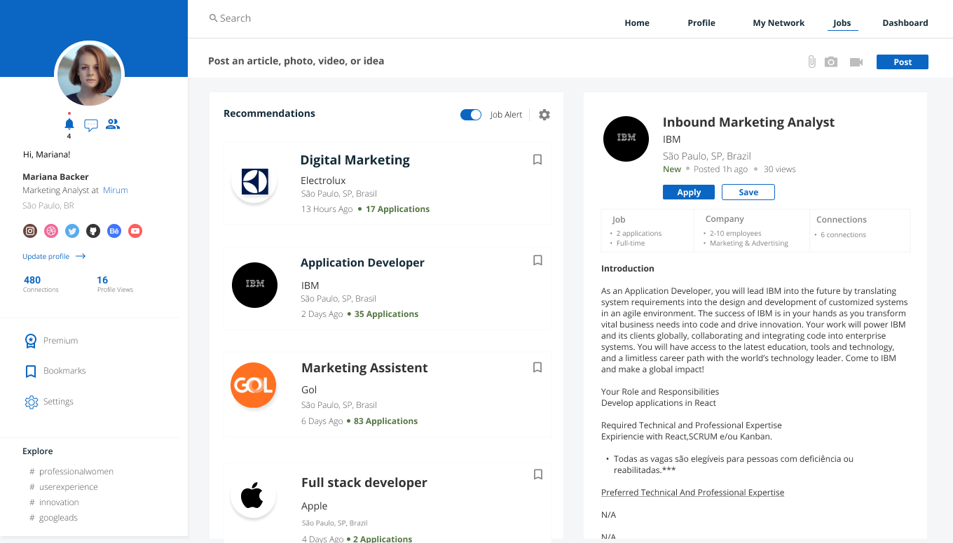
On the job spots page we enabled viewing the jobs details right next to the jobs list, so the user can view all jobs spots, save or apply them, all in the same environment.
The dashboard has a similar structure to mobile and is where the user will be able to analyze the access metrics on their profile and sharing posts.
Finally, we also brought the dark version that is much requested by LinkedIn users. We tried to leave the contrast colors with a lower saturation and the background darker with dark gray in some details